UX Design Project 2
Unibank Balance Transfer flow
Balance transfer flow for an online bank which has accessibility for all users

The problem: Some people are not able to go to bank so they need online banking. Most online banks are complicated for the first time users or people who is not familiar with technology.
The Goal: Design a balance transfer flow which is easy to use for every age and type of person .
My role: UX Designer designing a balance transfer flow for an online bank
Responsibilities: User research, paper and digital wire-framing, prototyping, usability study, creating mockups, accounting for accessibility, and iterating on designs.
User research
I conducted interviews and created empathy maps to understand the users I am designing for and their needs. A primary user group identified through research was university students who need an online bank.
This user group confirmed initial assumptions about Unibank browsers.
Pain Points
1 IA
Online banks are usually complicated and difficult for the first time users.
2 Special Aids
Not enough banks for university students who need more support with their payments.
3 Security
Logging and giving your details needs some serious security.
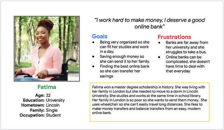
Persona: Fatima
Problem statement Fatima is a master student uses wheelchair who needs an easy online bank because she needs to do her balance transfer regularly
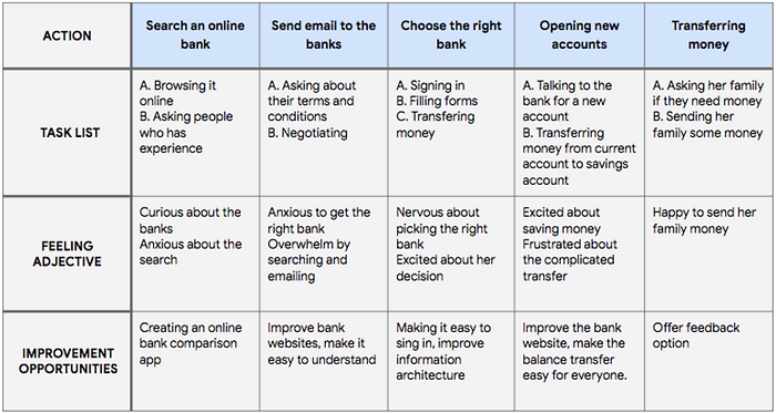
User journey map
Mapping Fatima’s user journey revealed how helpful it would be for the users to have more online banks with better websites.
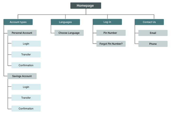
Sitemap
I created this sitemap to help with user to navigate through the site easily.
My goal was here to create basic pages in website and add most important feature.
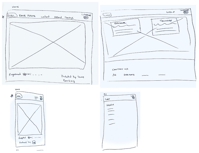
Paper wireframes
Getting started with wireframes on paper helped me catch problems before creating the digital designs.
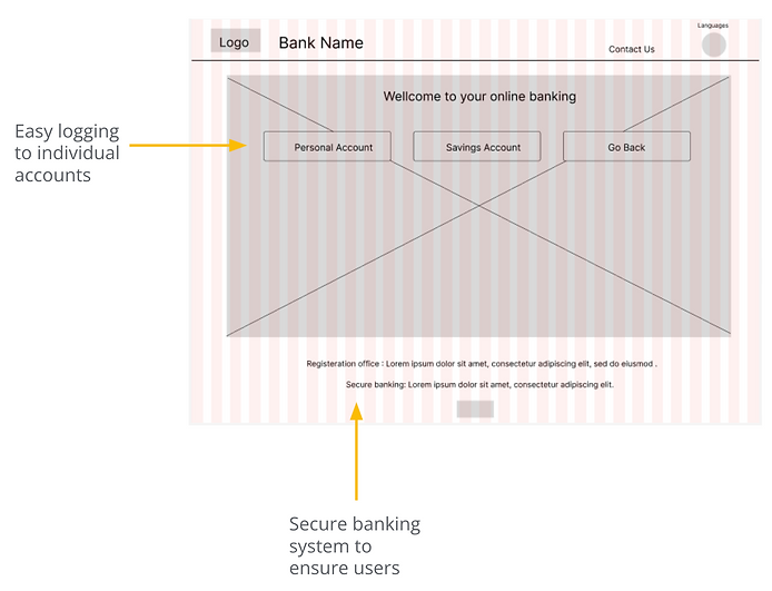
Digital wireframes
Needed some explanation and one click access to reach the accounts.
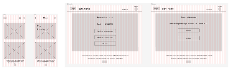
Digital wireframe screen size variations
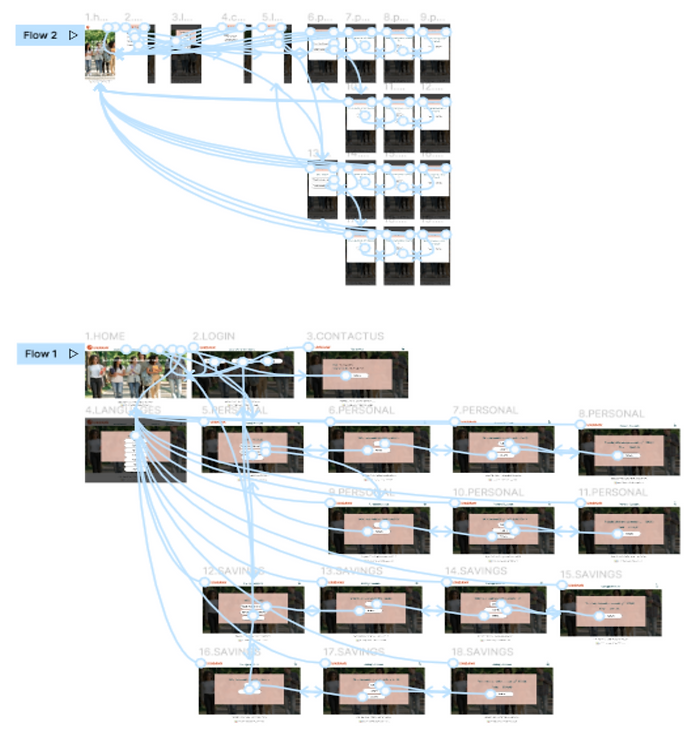
Low-fidelity prototype
Next, I started prototype my whole digital wireframe so I can create main user flow.

Usability study: parameters
Study type: Unmoderated usability study
Location: United Kingdom, remote
Participants: 5 participants
Length: 20-30 minutes
Usability study: findings
Finding 1: Users want individual buttons for accounts
Finding 2: Users are not sure where to find the information they want
Finding 3: Transferring experience is taking so long.
Mockups
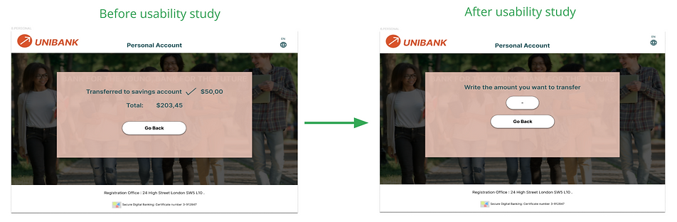
Before the second usability study there was no ‘’the amount of money I want to transfer’’ option. I added that option after the second usability study.
Original screen size
Screen size variations
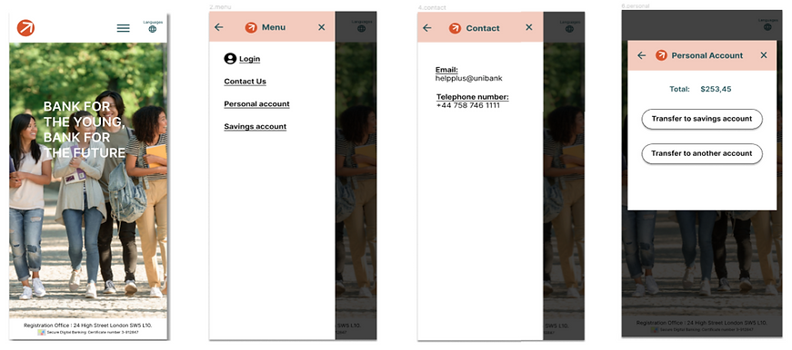
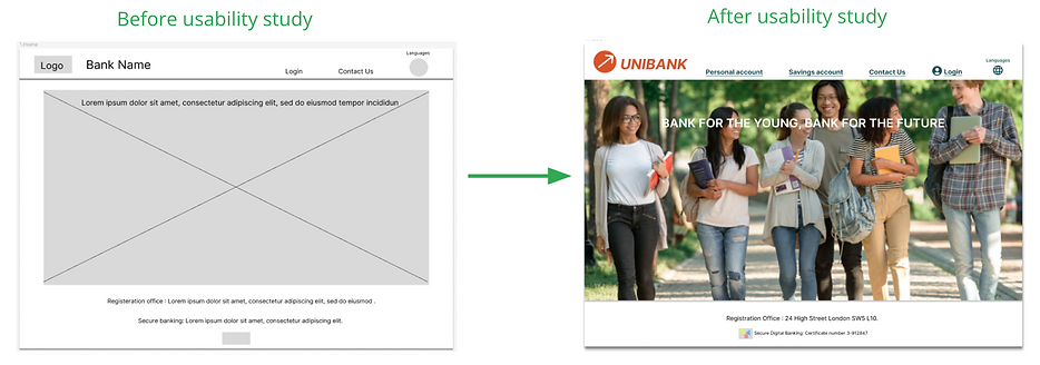
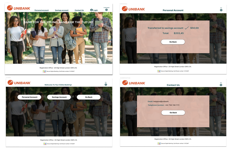
High-fidelity prototype
The final high-fidelity prototype featured more detailed but also easier user flows. Some screens were improved in the design to make money transfer easier.
Accessibility considerations
1
Colors and icons using tools to check the accessibility.
2
Designs with element sizes and hierarchies
3
Provided access to users who are vision impaired through adding alt text to images for screen readers.
Takeaways
Impact
The website allows you to transfer money to your accounts or another accounts in a very easy way.
One quote from peer back:
‘’As a low budget university student it feels so safe and easy to use!’’
What I learned:
It is very important to do user tests and receive feedback to find key points and opportunities for improvement in the website.
Next Steps
1
I will have a new usability study to test the final design.
2
Make new adjustments to the website through metrics and user comments.
3
Conduct more user research to determine any new areas of need